


EDGES IN PHOTOGRAPHY.
-Photography is an art because it is about the photographer what to leave in and what to not include.For example if you were taking a photo of someone you might chop a tree off in the background and make the person in direct focus.
-Edges can take something out of its normal context/setting and therefore influence the viewers perspective on the photo.For example if you were taking a picture of a busy beach you might chop the beach of to create a calm picture of the sea.
-Edges can also define and give special meaning to a photo
-Finally edges frame the photo sometimes emphasising the content of the photo.
PHOTOGRAPHERS GALLERY TRIP
First we got the train to green park. Then we walked to the photographers gallery. Inside the photographers gallery we looked at different artistic photos a shared what we thought the meaning behind them were.Finally we took our own pictures in Trafalgar Square.
These are some of the edges pictures that i took...


Paper Edges
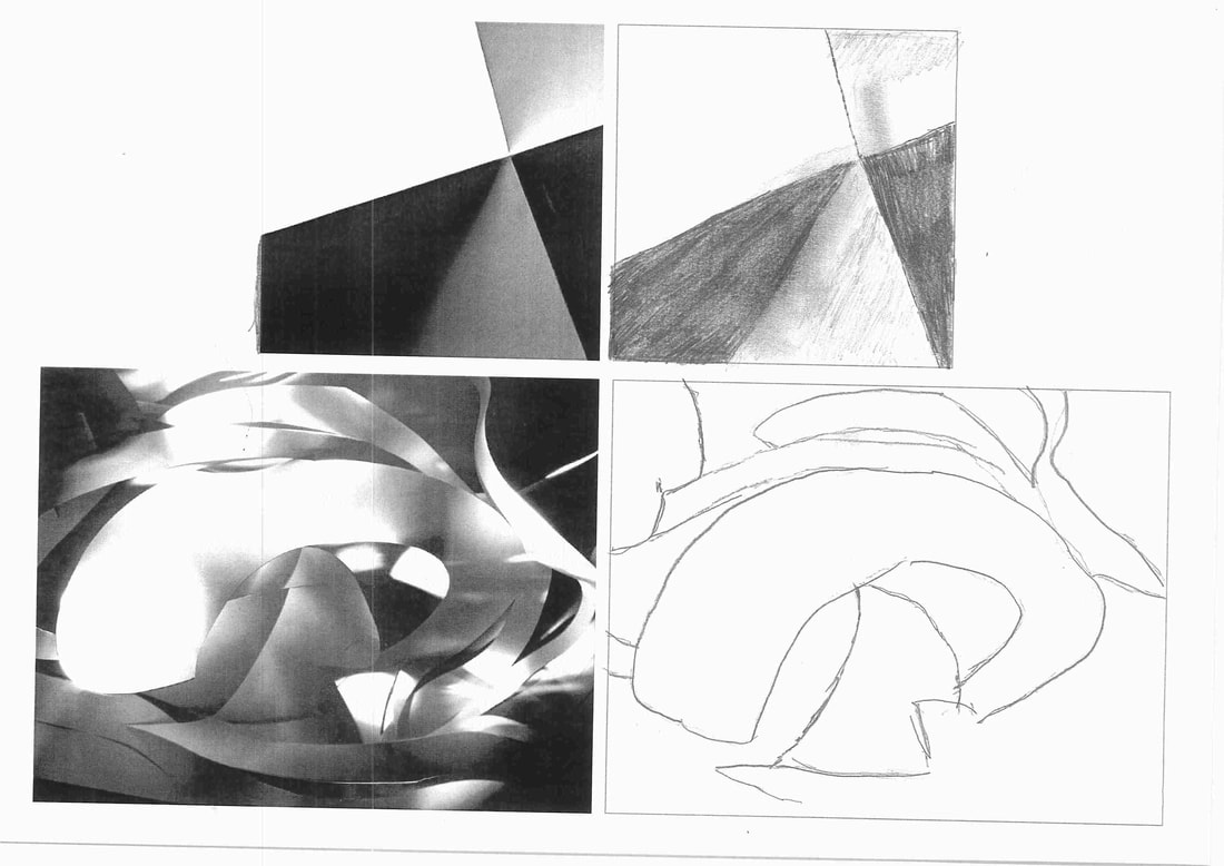
The point of the task was to realise how the light falls on the image and then try and draw it ourselves.I found the curvy image much harder because it was much more detailed with many more different tones that contrast each other.
paper cutting photos
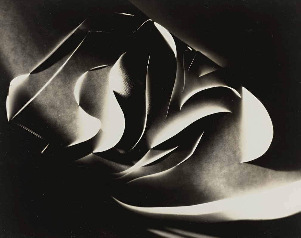
These paper cutting photos are inspired by Francis Bruguiere


Here is my best paper cutting photo...

CONCERTINA BOOKS.
This is a simple video in how to make a concetina book.
This is my concertina book about edges...


PAPER EDGES ANALYSIS
|

|
1.Both images are made by cutting paper however they are made very differently.The left was made with a sharp knife.I can tell this because of the elegant curvy lines.The left could of even been made with scissors. I can assume this because of the linear lines making geometric shapes.
2.The left pictures cuts are all very curved and not at all abstract. The right pictures cuts are very geometric , mostly making triangles and other shapes.
3.In Francis Bruguieres picture there is a variety of tones including very dark points and also mid light highlights.This adds contrast to the photo.In the right picture there is only really two different tones ; very dark and very light points.
4.I described the left picture as being : curvy , dark and complicated.I described the right image as being : Abstract , linear and geometric.
5.I prefer the right image because of how simple and geometric it is. Also i find the left image too complicated to take in and find interesting.
POST-IT NOTE EDGES


Mondrian inspired photos...
Piet Mondrian is an abstract artist who is best known for his use of linear lines, primary colouring and geometric designs. When I approached this task, I decided to base my Mondrian photography on modern architecture on nearby housing estates. The reason I chose these locations is because the buildings there are designed with simple lines and the patterns of windows are often repeated. Whilst walking about, I also noticed Mondrian-style geometry elsewhere: for example, on the red bus with it's black window frames and yellow poles; and also on the athletics track markings and the lockers at a local sports centre.


Photocopied photography...


PICTURE PERSPECTIVES


Photoshop

EDGES EXHIBITION (extended project)

I decided to display my Edges photos on the exterior of the former Eltham Park railway station on Westmount Road. I chose this location mainly because of the diagonal ridges that go across the outside boards. The raised ridges frame the photos well and make them stand out. As the exhibition theme is "edges', I thought it was good to display the photos in a place with prominent edges. I measured the width of the space between the lines and then printed and mounted my photos to fit between. I chose bright orange and purple card to mount them on because I wanted a strong contrast between the photos and the dull, grey/green paint on the building. I think it's a good location because it's at the top of a busy parade of shops and on a main road so it gets a lot of passers by. This was obvious when I was putting the photos up as a few people passing by stopped to look and ask me about my photos. The photos that I chose for the exhibition are a mixture of architectural and natural world based; however, the edges are the most important part in all of them.


This is my leaflet to advertise my exhibition...

Edges comparison
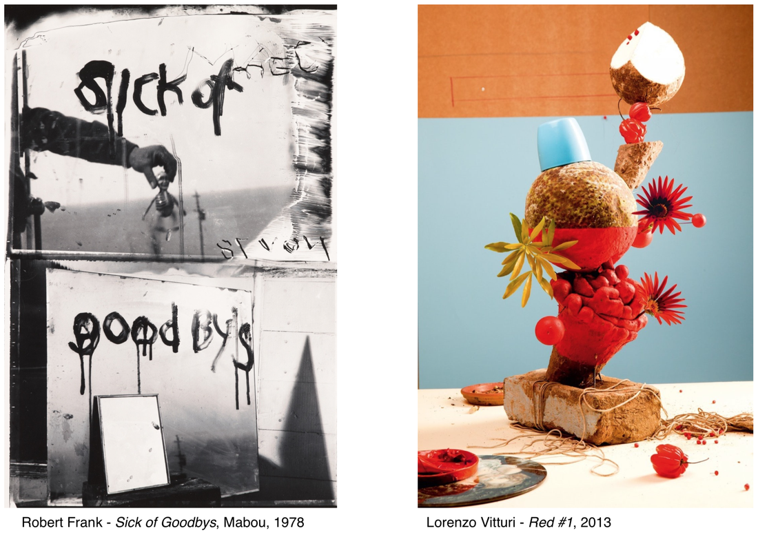
In sick of goodbyes by Robert Frank the atmosphere is dark and miserable making the backstory behind it seem sad and depressing .However Red by Lorenzo Vitturi is bright and colourful with plants and pots piled on top of each other.The main subject in the first picture is the mysterious mans hand. The main subject in the second picture is the plants and pots piled on top of each other.
The main difference between the photos is the colours and atmosphere.The left photo is in all black and white. This is the opposite to Red which has vibrant contrasts in colour - the top is orange the middle blue and the bottom white.The image by robert frank is quite simple. However Red is a lot more complicated for example in the background there are three different contrasts in colour and there are are lots of objects in the image.I find Red most interesting because of the background contrasts in colour.
In Lorenzo Vitturis - Red picture i think that the edges are in the background.There are straight blocks of colour which contrast with each other.However this is not the focus of the image. In robert Franks- sick of goodbyes there are much more like the sea the trap door and the triangular shaped shadow on the right to the goodbye. Also i think that there is a mirror which would add reflections and edges to the photo.I would ask Robert Frank if he had experienced a loss to motivate him to make this photo.I would ask Lorenzo Vitturi if the image was photoshopped so that he could balance all the objects on top of each other.
you could call sick of goodbyes sadness because it is shown in all black and white. you could call red diversity because of the contrast in colours in the background.
photoshop


